Daisy: a trusted AI assistant that reduces support calls
From discovery spike to MVP release to post-launch iteration, helping 340,000 customers get answers without picking up the phone.
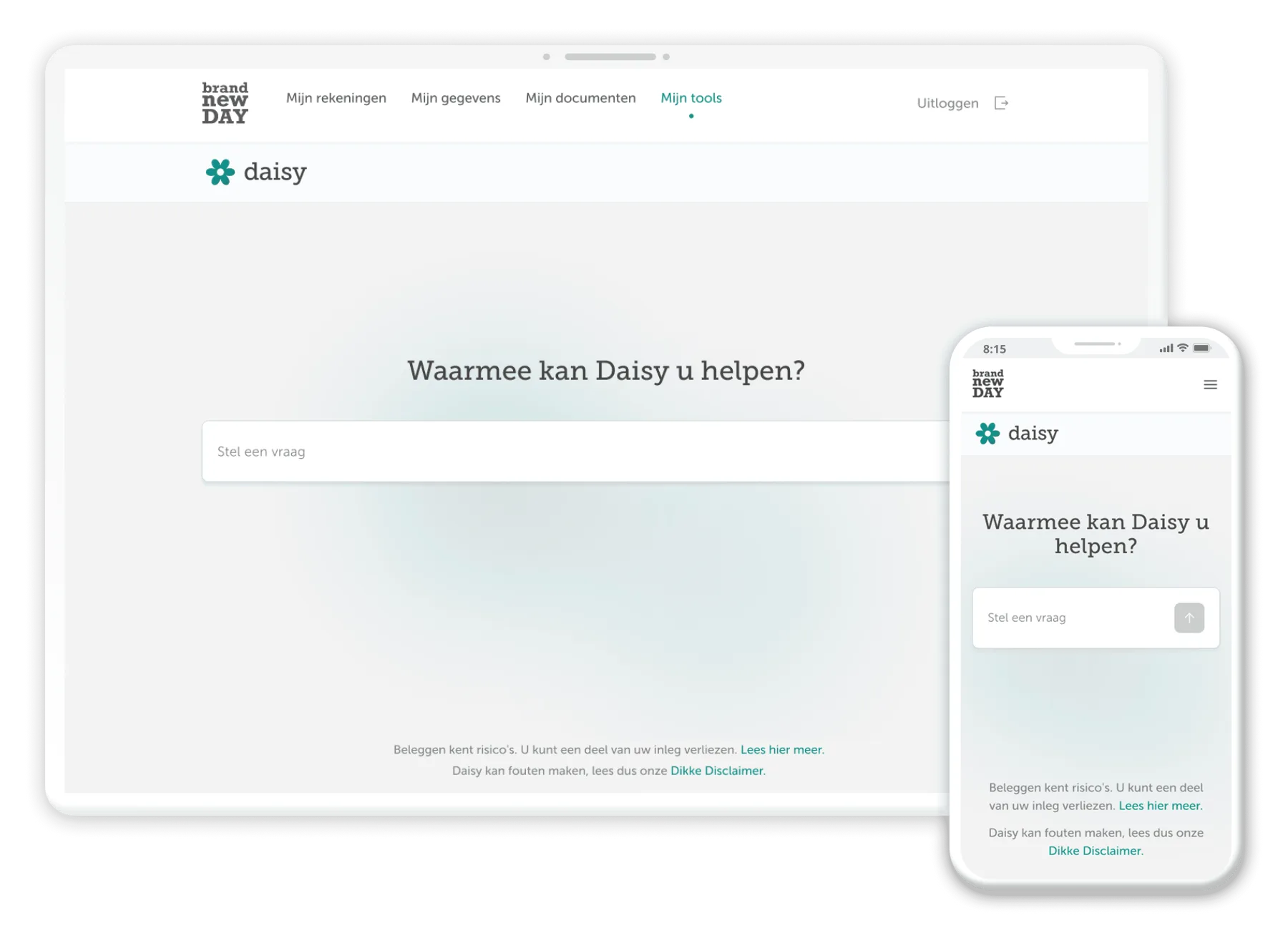
Daisy answers questions about pensions, jaarruimte, savings and investments inside Brand New Day's customer portal, using the customer's own account data. No phone queue, no office hours, no wondering if a question is too obvious to ask. She's live to the full client base.
Problem & context
The answers were published. People called anyway.
Brand New Day already published a great deal: an extensive FAQ, jaarruimte explainers, calculators, product pages. To use any of it, a customer had to know what to search for, then read a general explanation carefully enough to work out whether it applied to their own account.
Most people don't do that. They call because it's faster, it's certain, and someone tells them the answer that applies to them. So Customer Service absorbed the same questions repeatedly, and anything asked outside opening hours waited until morning.
Business context
An assistant taking the routine questions would free Customer Service to focus on cases that need judgement. But this is a regulated market: a financial firm cannot let software give personal financial advice, and an assistant that sounds confident while being wrong is worse than no assistant at all. The boundaries had to be designed as carefully as the capabilities.
Consent. Customers can't access Daisy until they agree to their account data being used.
Clarity. Daisy shows what she's doing while she works, so the wait feels shorter than silence would.
Escape. A route to a human is available at every point, and Daisy offers it herself when she detects she should. The customer always agrees to the handover first.
Role & scope
I shared ownership of Daisy's design work with our design lead. He led, and we split and reviewed the work between us. I ran the discovery spike and the follow-up investigation into feedback mechanisms, then designed the chat interface itself: how a conversation opens, how questions and answers are told apart, how the input behaves, how a conversation ends. From there: the consent experience, the waiting state, the exit and chat-loss flow, the escalation flow, and the feedback entry point.
Stakeholders spanned the design lead (co-owner); the AI team (agent behaviour, knowledge base, response copy); product owner, BA, front-end, back-end, QA; Legal & Compliance; and Customer Service, both as stakeholder and as the destination of every escalation.
Research & insights
The discovery spike
Before there was a product: would an in-portal assistant actually help, and what would it have to get right? I ran that investigation, covering conversational UI patterns, feedback loops, WCAG 2.2 AA accessibility, multi-device behaviour, design-system impact, and a benchmark of pension and finance chatbots. It produced a recommendation, a list of UX risks, and open questions for Business and Compliance. Several of these became the design problems that took up the next year: consent, refusal, and reaching a human, designed in from the start rather than added once Daisy was live.
What people already expect
I pulled apart ChatGPT, Copilot and Gemini across layout, interaction flow and visual hierarchy, then swept banking and finance apps, not to copy patterns, but for Jakob's Law: people expect your product to work like the ones they already use. What transferred: the centred input that anchors to the bottom after the first message, visible distinction between question and answer, thinking indicators rather than dead air, sources shown after each answer, a sidebar holding past conversations. What I rejected: one competitor's flat hierarchy, where prompts, responses and sidebar carry equal visual weight and the conversation becomes unscannable. In a pension conversation full of numbers and conditions, scannability isn't decoration.
Nine rounds of testing before launch
Between October 2025 and April 2026, nine structured sessions ran with Brand New Day employees from Marketing, Customer Service, Legal & Compliance and Sales: free testing, scenario testing, and finally red-teaming. These changed the product, not just the copy: the consent step, the progress messages, the escalation flow and the formatting of Daisy's answers all came in as direct responses to session findings. A separate comprehension test on the Daisy information page and a five-second findability test ran against thresholds set in advance: 80% comprehension, under 10% major misconceptions, 75% first-click accuracy.
Process & solution
Five customer-facing surfaces: entry points, consent, the conversation itself, escalation, and the financial-advice guardrail.
01 · Entry points
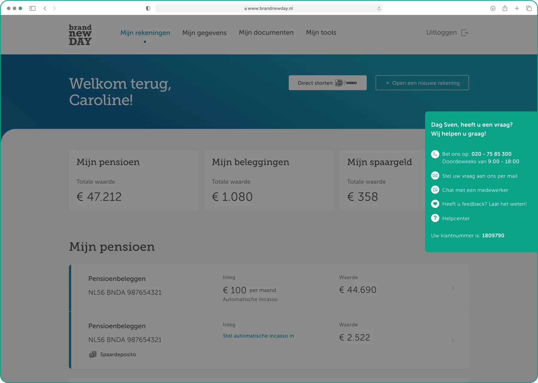
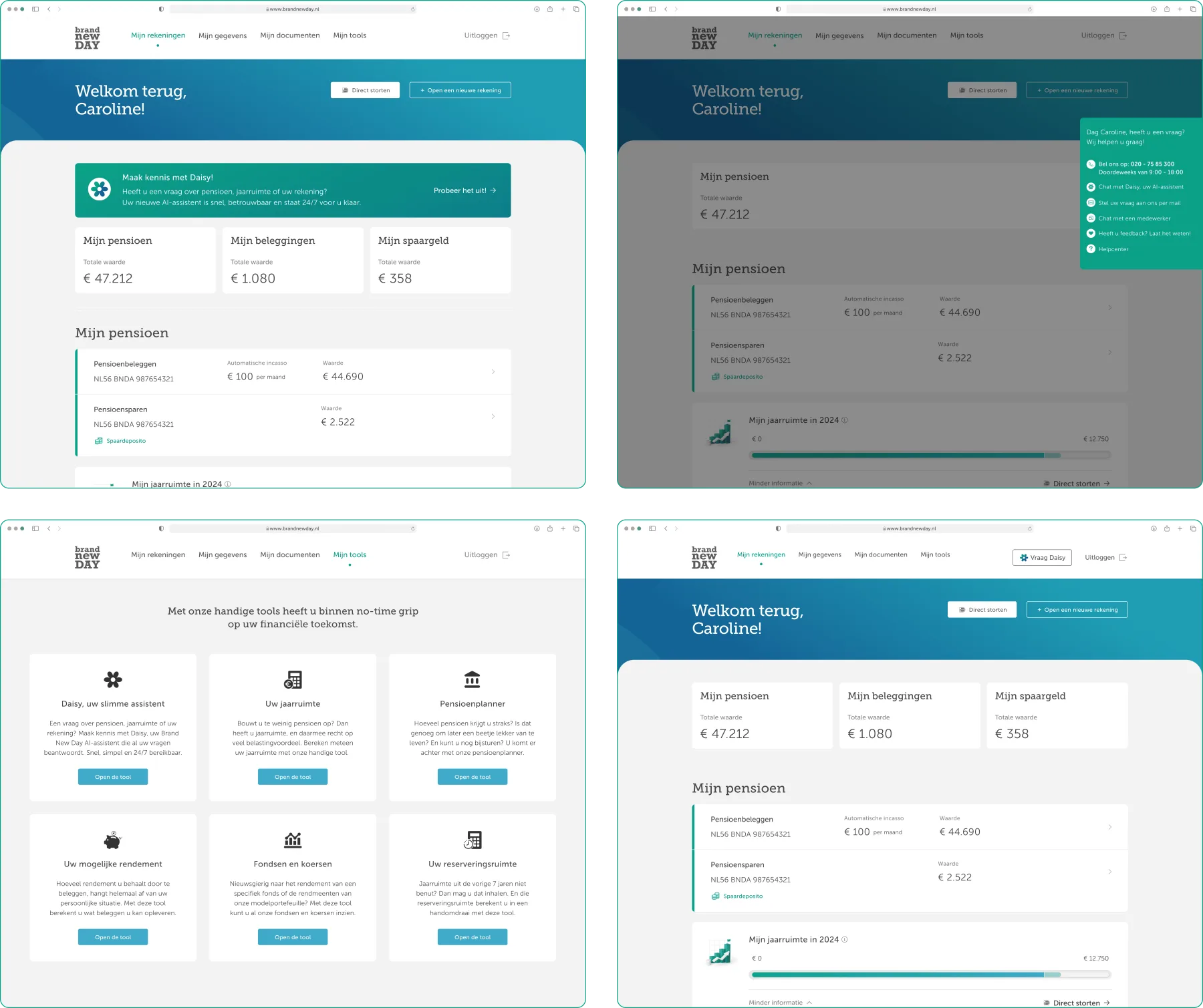
An assistant nobody can find is an assistant nobody uses, and the portal already had a crowded dashboard, a tools section and a help centre each claiming to be the front door. Three entry points went live, each matched to a different intent: a card in Mijn Tools alongside the jaarruimte calculator, an entry in the help-centre panel, and an introductory banner, “Maak kennis met Daisy!”, for people who weren't looking. A permanent entry point in the portal header was designed and cut from MVP scope; the banner does that job in the meantime, which is worth naming as a compromise: an introduction is not an always-available door.
02 · Consent
Daisy's advantage is that she can see the customer's account, which is also the reason to ask permission first. A blocking consent step appears before she loads: plain language about what she uses and why, an explicit statement that conversation data stays in the EU and never trains models, and two options, Ik ga akkoord and Liever niet. Consent persists, so it's asked once. Choosing Liever niet doesn't dump the customer on a dead end. It explains that Daisy can't work without the data and routes them to email, chat and phone. Declining is a legitimate choice, not a failure state.
03 · The conversation, and the wait
Daisy is slow, not badly built, just genuinely working: retrieving account data, searching the knowledge base, composing an answer. In testing, silence during that gap read as broken. Three parallel fixes were agreed: the AI team improved response times and added a first acknowledgement, and design covered the wait itself. A greyed Daisy mark shimmers against a live status line, like searching the database or analysing the answer, appearing within 100ms, updating as the work changes, and cross-fading into the answer with no layout jump. If nothing arrives in time, an inline error offers Retry and Cancel.
Once front-end was building the chat, testing showed the conversation viewport was too small. Customers were scrolling almost line by line because the header claimed vertical space before the chat got any. I reworked the spacing and defined the full type scale for every element an answer can contain: headings, lists, tables, emphasis. One rule set instead of improvised decisions, and pension answers became scannable. The AI team owned the words; the shape they arrive in was mine.
04 · The financial-advice guardrail
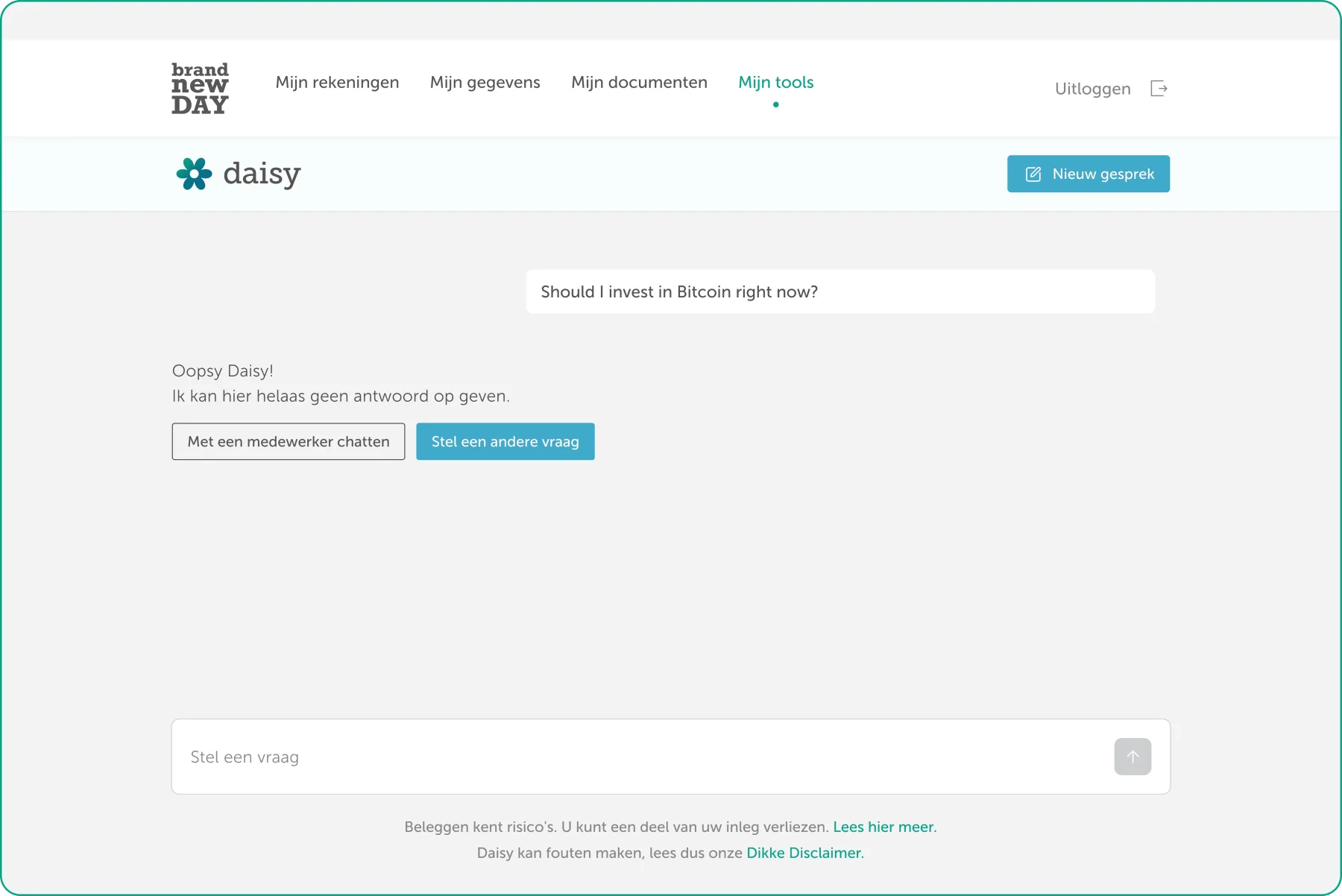
“I have €30,000. Should I put it all in my deposito account?” Daisy must not answer that. Not badly, not with a disclaimer, not at all. A blocked state rather than a hedge: the question stays visible above the response, so nobody wonders whether it was received. Daisy answers with “Oopsy Daisy! Ik kan hier helaas geen antwoord op geven,” a refusal that doesn't sound like a system error, and offers two routes: chat with an employee, or ask something else. The input stays inactive until the customer picks one, so nobody rephrases the same question into a different refusal. Warm on refusal is deliberate: a cold compliance message mid-conversation reads as the assistant switching sides. The playful line keeps the persona intact while the boundary stays absolute.
Handing a customer to a human
The hardest thing an AI product has to do well. An assistant that can't hand over is a trap. The escalation design covers when it happens, who starts it, and what the interface does while it's happening.
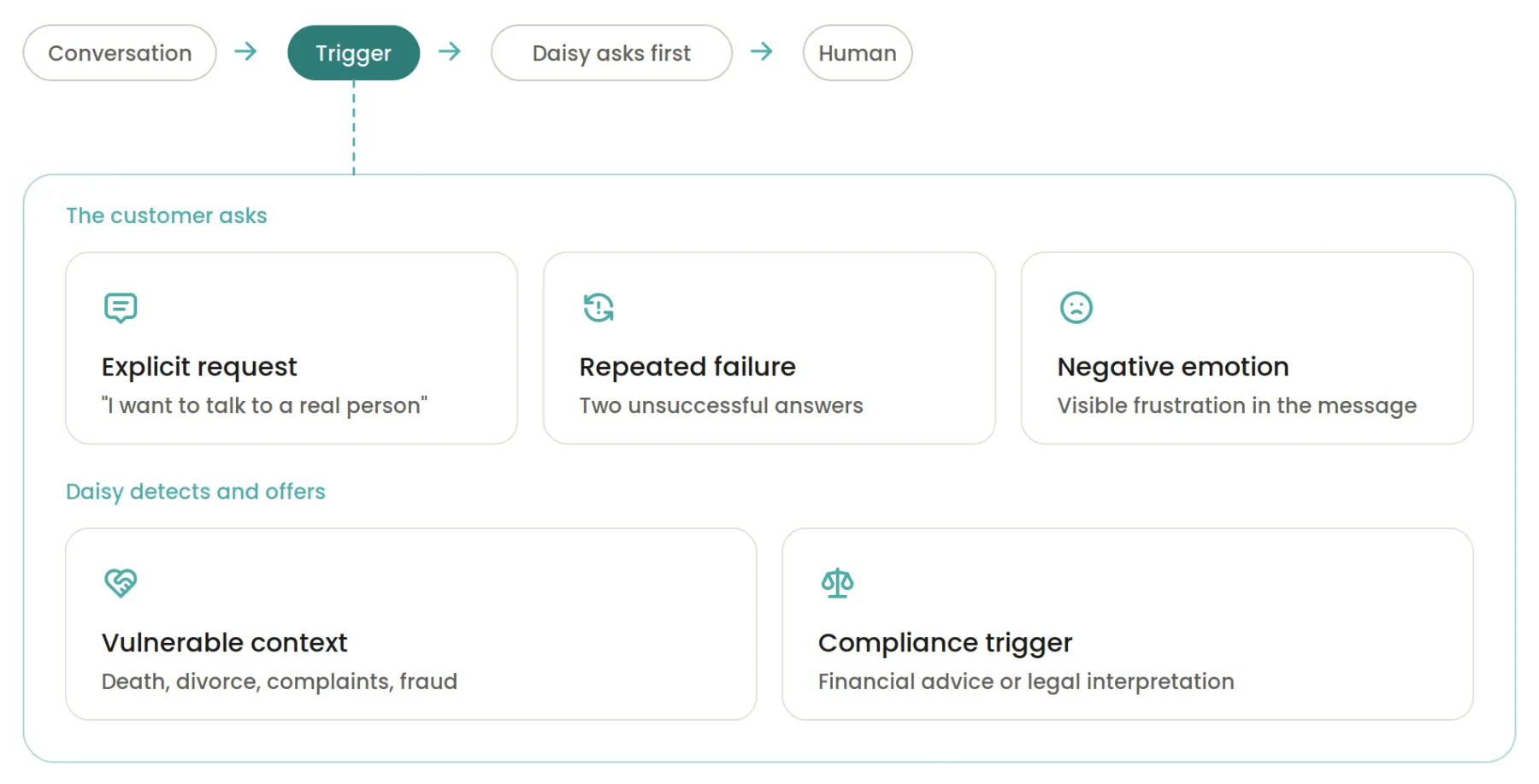
When the system detects friction, Daisy asks first: “This looks a bit tricky to resolve here, and a specialist can help faster. Shall I connect you now? I'll share our chat history so you won't need to repeat yourself.” Nobody gets transferred without agreeing, and if the customer says no, she doesn't offer again for the same issue. When the customer asks directly, it's immediate confirmation with the same promise about the history.
During handover, the conversation stays on screen: visible, scrollable, not cleared. The input disables the moment escalation starts, so nobody types into a channel that's no longer listening. Live chat opens alongside with waiting time and status. When the human closes the case, the conversation is still there and the input stays disabled, because that thread is finished. Outside business hours, the handover becomes a callback request instead of a dead click.

Designing for failure
Daisy wasn't built as a happy path. Several edge cases were designed alongside it, and this is where most of the interface work sits.
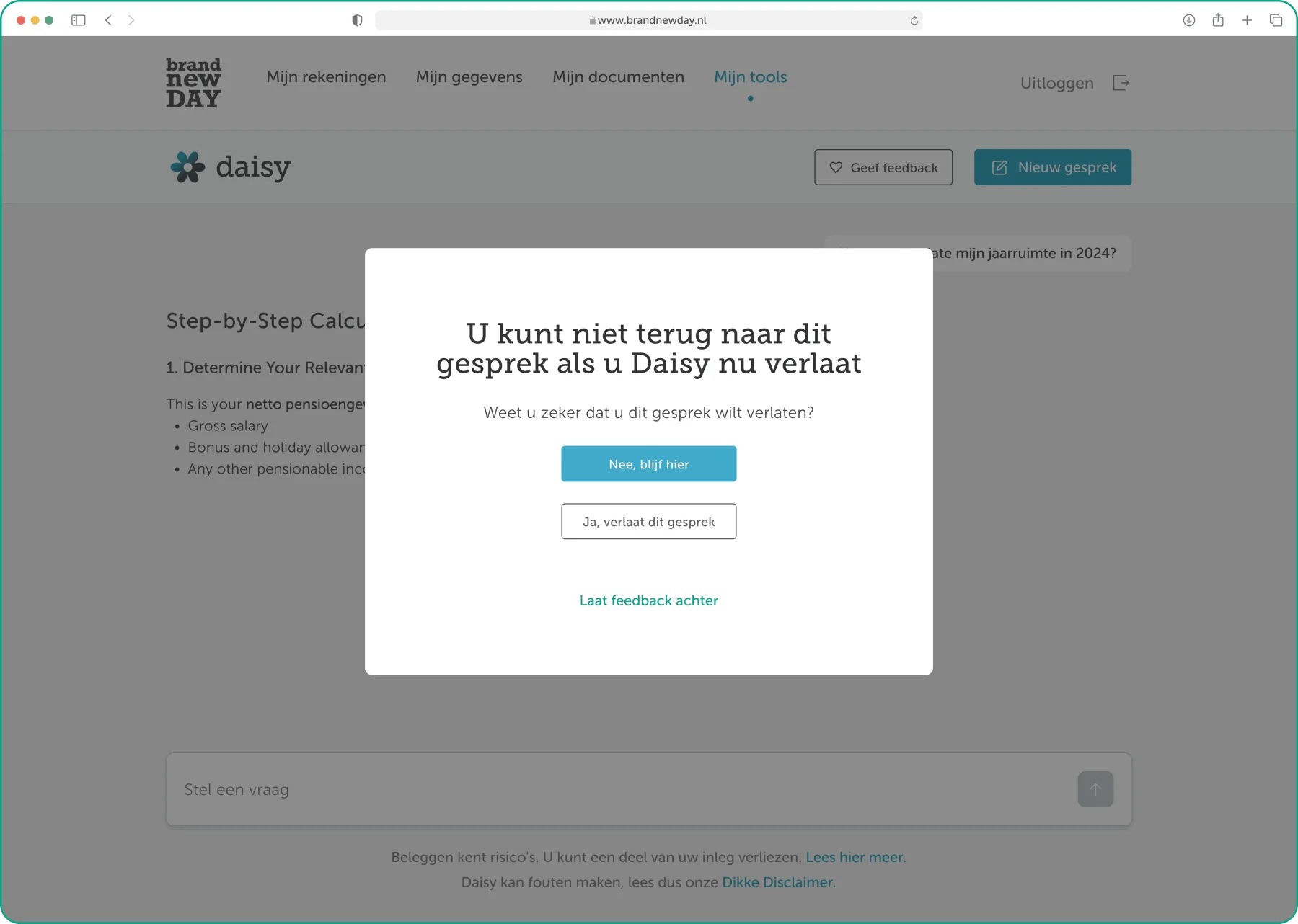
Leaving without saving
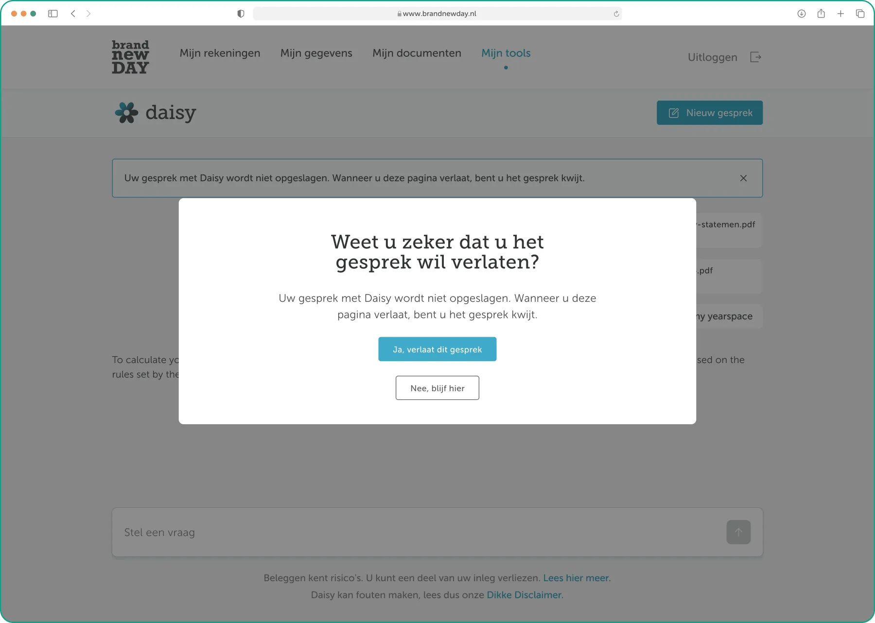
Conversations aren't stored in the MVP version. The original design warned people at the start of the session; testing showed users forgot the warning and only registered the loss after they'd already left. The warning moved to the moment of leaving instead: a blocking modal at exit, tab close, or navigating elsewhere. No, blijf hier is primary, leaving is secondary, and a third option opens feedback on the way out.
Session timeout & unavailable states
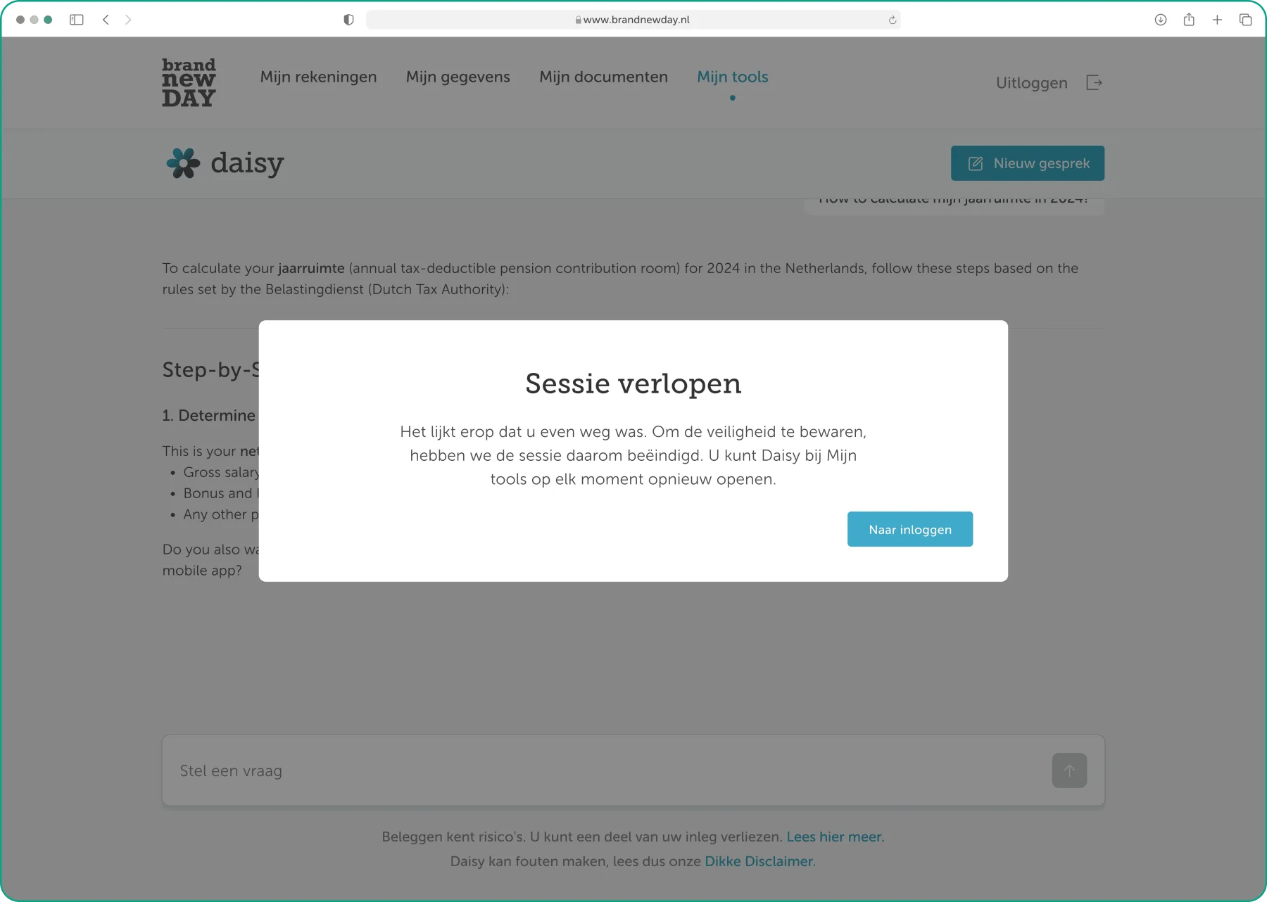
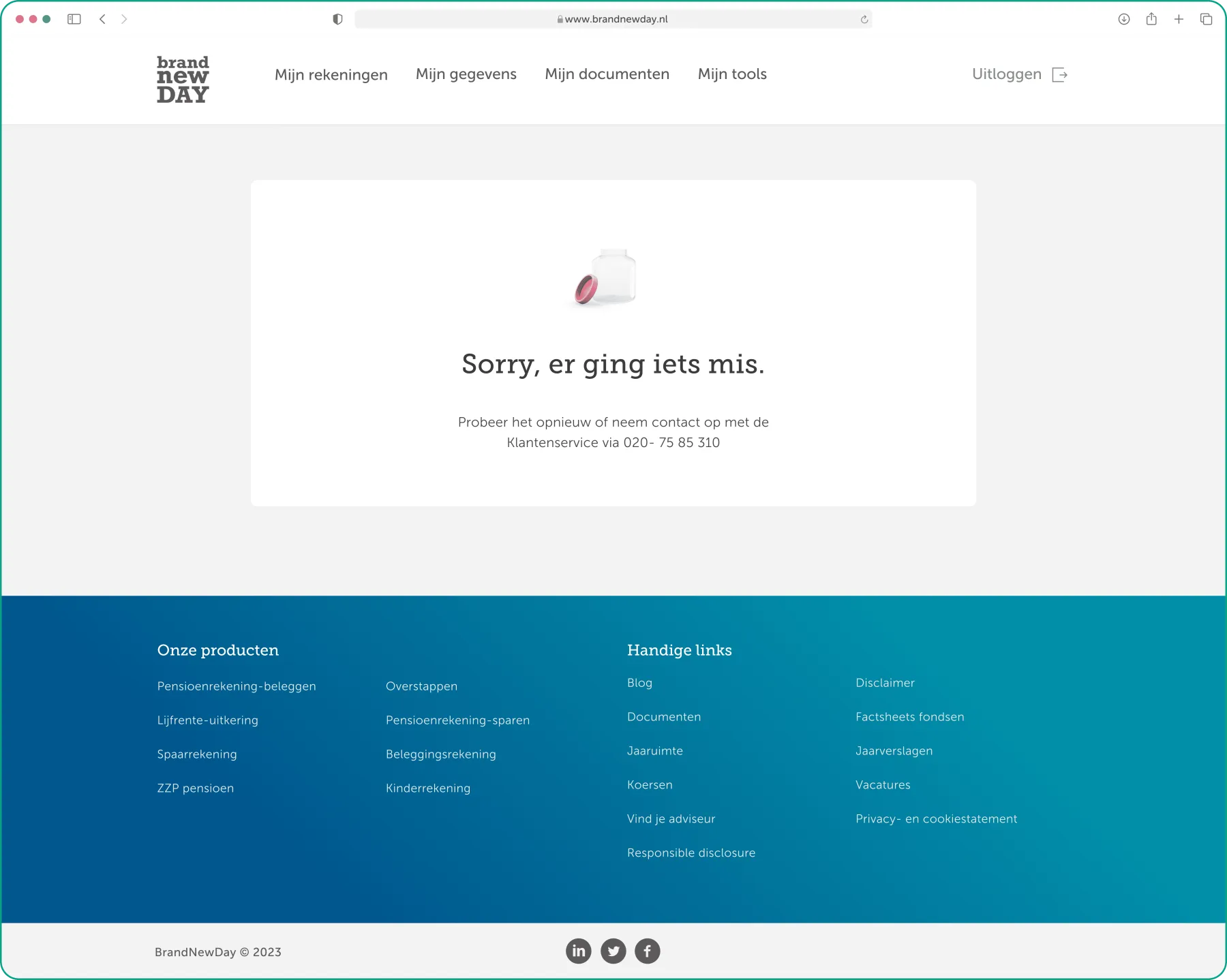
After 15 minutes the session ends for security; the customer gets an explanation and a route back via Mijn tools. When the backend is down, Daisy says so and gives the customer-service number, rather than failing to respond and leaving people in the dark.
Feedback
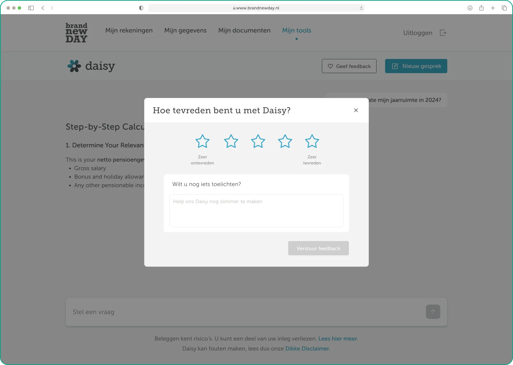
Opening a new conversation while one is active triggers the same loss warning as leaving. A Give feedback entry appears next to Nieuw gesprek once a conversation has started. Collecting feedback was the point: it's what tells the team where Daisy falls short. It opens the same modal as the exit flow, but returns the customer exactly where they were, and stays available for as many submissions as they want.
Shipping to 340,000 people, slowly, with the brakes on
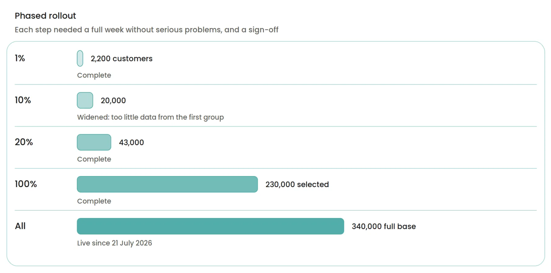
Before each widening, Daisy had to run a full week with no serious problems and someone had to sign off. The team agreed in advance what would send her back: giving financial advice she shouldn't, saying something harmful, exposing customer data, or being down over an hour. Staged release changes what you design: every state has to work for a customer who has Daisy while their partner doesn't, and every decision stays reversible for two weeks after it ships.
The business reports Daisy has been helpful and has reduced customer-service contact. I don't have the numbers yet. Measurement is in place and the figures are pending.
Every change came out of testing
Nothing significant about Daisy's interface was decided on opinion. The consent step, the progress messages, the escalation flow, the timing of the loss warning and the density of the conversation were each a response to something a session or a test surfaced.
Boundaries are the product
The temptation with an AI assistant is to design the conversation. Almost everything that mattered was at the edges: consent before it starts, refusal when it must, handover when it can't, warnings before something is lost. The happy path largely designs itself once the boundaries are settled.
Design can't fix a slow answer, only make it bearable
The thinking state didn't shave a second off Daisy's response time. It made the wait legible, and that stopped people assuming she was broken. Some problems in an AI product belong to engineering; the design job is holding the customer's attention until they're solved.
What I'd do next
Four things were designed and then cut from MVP on timing, none dropped on merit: a permanent Daisy entry point in the header (discoverability currently rests on a banner that gets dismissed, and the most likely reason a customer never uses Daisy isn't that she failed them, it's that they never found her); conversation history and a sidebar, since every conversation is disposable right now; feedback per answer rather than per conversation, so a rating points at exactly what went wrong; and voice input and output, for customers who struggle with typing or reading a screen.