Evi brand evolution: a modern design system
A premium, magazine-like refresh of Evi's visual identity, with accessibility built into the components, not bolted on.
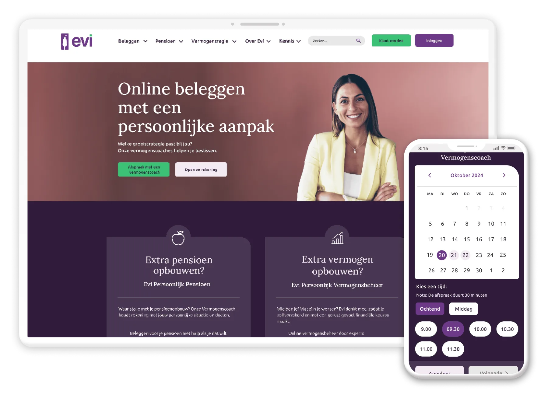
Overview
Working with the senior UX designer, I helped refresh Evi's brand identity, aiming for a modern, sophisticated, future-oriented aesthetic that aligned the brand's visual and digital presence with its evolving position in the financial landscape, for a mass affluent audience, without sacrificing accessibility or usability.
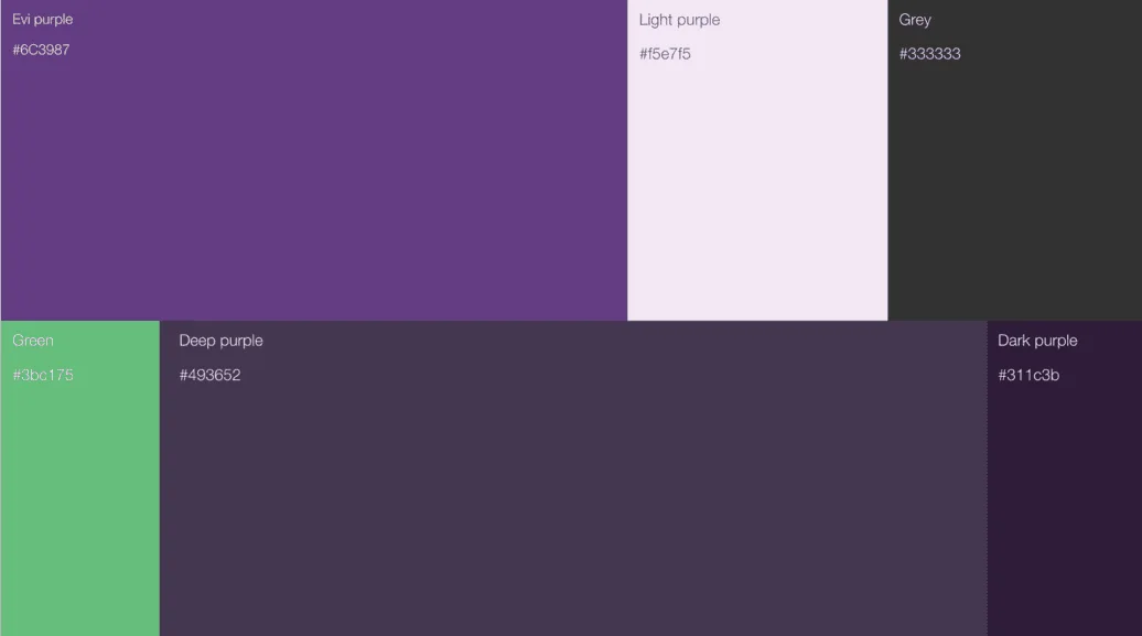
The scope covered an enhanced look and feel: a more stylish, magazine-like appearance with a premium feel, keeping the original palette but introducing darker shades and refined contrast; a scalable design system supporting consistency across platforms; new landing pages balancing sophistication with approachability; UI-kit improvements built around accessibility ahead of the mid-2025 deadline; a UX pass across navigation and readability; and unifying Evi's subdomains under one cohesive design strategy.
Design system
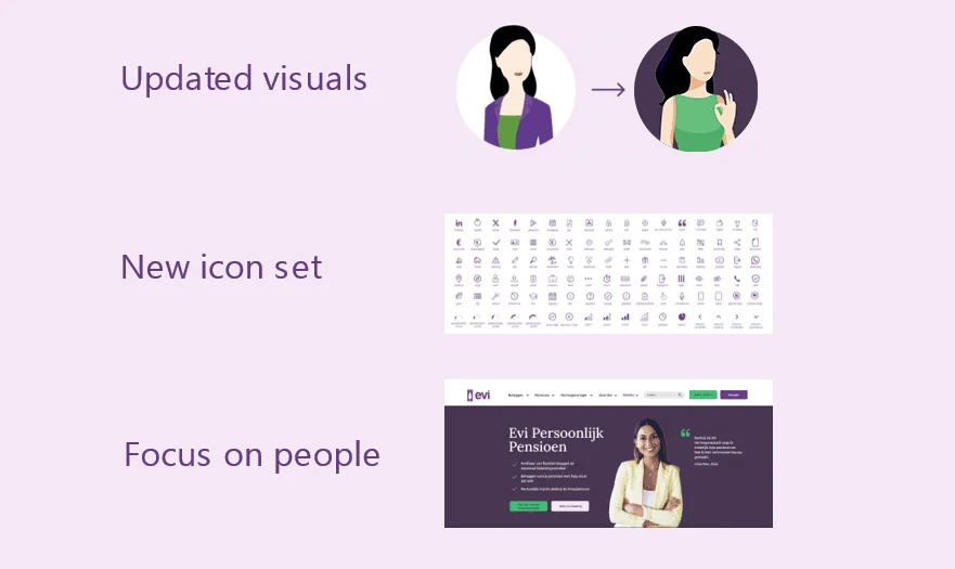
Part of the refresh was a shift in the visual language itself: flat persona icons gave way to illustrated people, the icon set expanded, and website sections were rebuilt around real photography rather than abstract graphics.
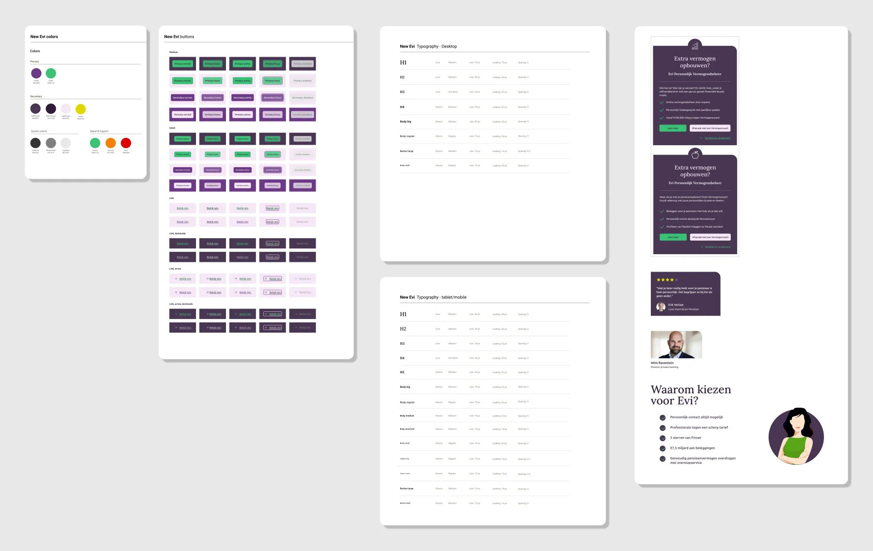
The system itself became the deliverable that made consistency possible: a documented colour palette, a full button-state library across sizes and contexts (including dark mode and link variants), and a typography scale specified separately for desktop and tablet/mobile.
Unifying subdomains meant the same system had to travel, including into sibling products like Evi Lead Master, the internal sales tool, so the brand read as one thing wherever a client or colleague encountered it.
Accessibility
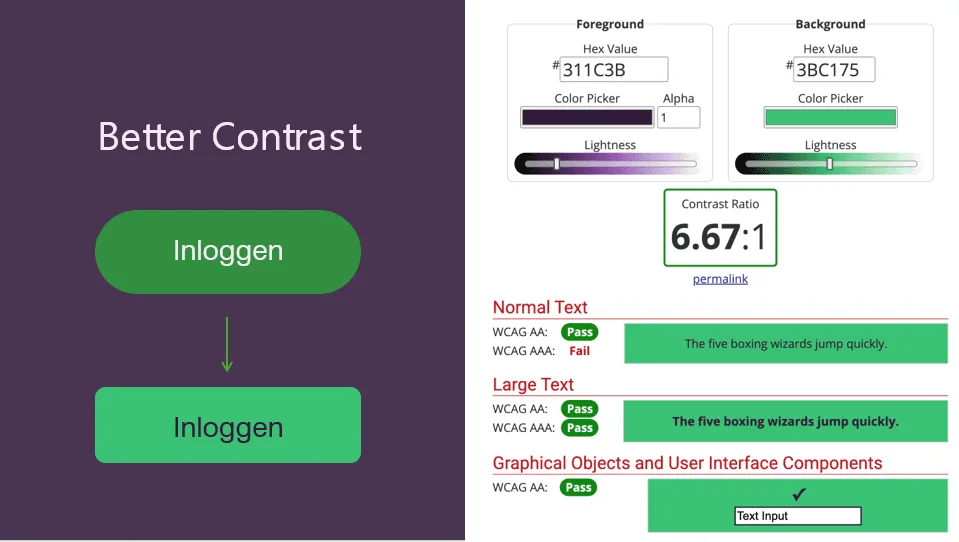
Accessibility requirements were integrated ahead of the mid-2025 deadline, not treated as a late pass. Contrast ratios were checked and raised component by component.
Why this update matters
Contemporary vision. Evi's original brand style, innovative in 2013, needed a future-forward update to resonate with today's digital landscape and audience expectations.
Mass affluent appeal. The refined aesthetic caters to the segment's aspirations, emphasising a high-quality, professional image that instils trust and exclusivity.
Accessibility commitment. Embedding accessibility into the core of the design future-proofed Evi's digital ecosystem ahead of the European Accessibility Act, mandatory for all websites from July 2025, and made the product more inclusive for everyone, not just a compliance checkbox.