Redesigning Evi Lead Master for sales efficiency
A user-centered approach to an internal tool that sales colleagues relied on all day, every day.
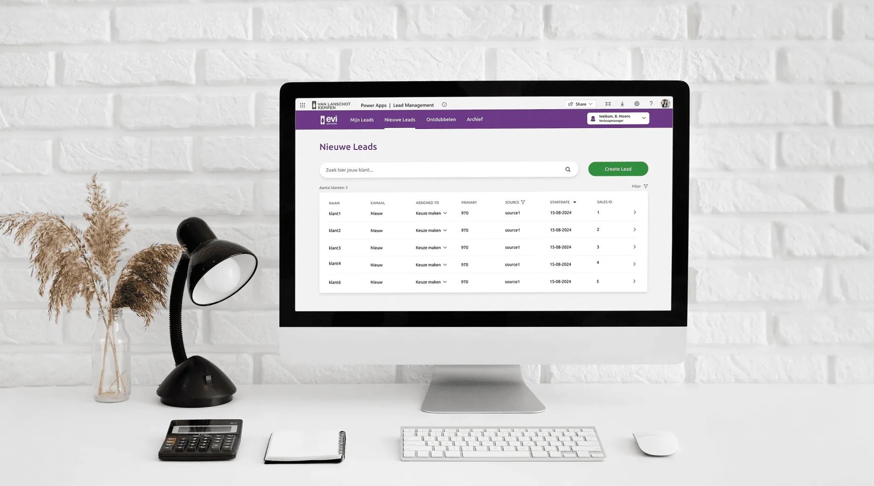
Who is Evi Lead Master?
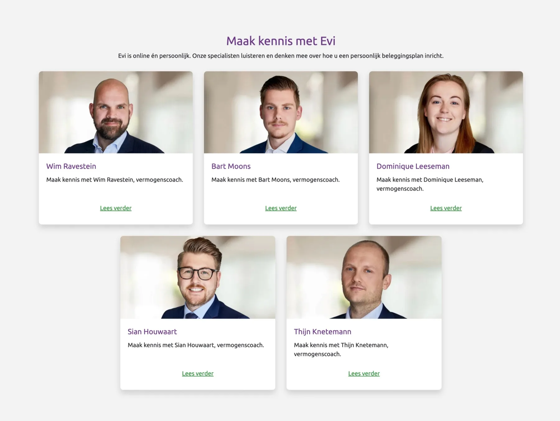
Evi van Lanschot is a digital platform offered by the private bank Van Lanschot Kempen, providing investment and financial services to the mass affluent market in the Netherlands. Evi Lead Master is an internal application that Evi's sales team uses to manage clients, follow their process, and act on their needs immediately. Each client is a “lead”, with a page tracking who called them, what was discussed, next steps, and dates. Leads sign up via the public website and are assigned to a “vermogenscoach” (wealth coach) who reaches out to them.
Why is this a problem?
Sales representatives faced significant challenges with an outdated, unclear, inconsistent interface and confusing navigation. They struggled to manage leads effectively, sometimes calling the same customer twice while missing others, which hurt both productivity and customer satisfaction. The objective: an aesthetic, minimalist, consistent, and error-preventing redesign that improved the day-to-day workflow for sales colleagues.
Research
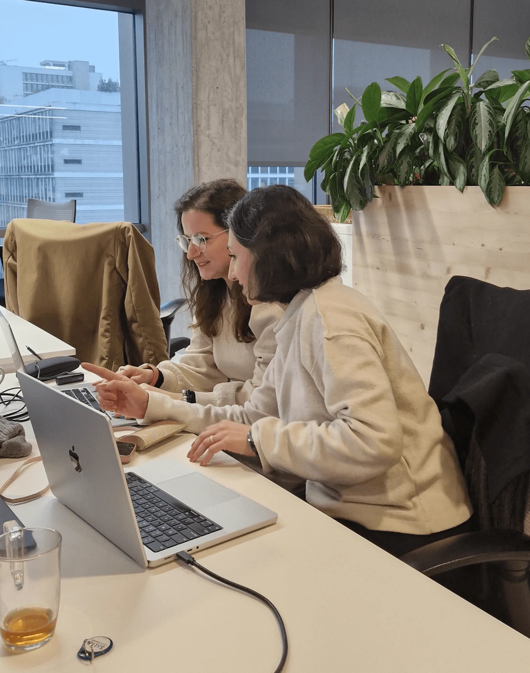
I led every step from problem to solution: interviews, journey mapping, heuristic evaluation, competitive analysis, brainstorming, prototyping, and iterative testing, working closely with the product owner, scrum master, director of sales, a data analyst and a developer.
Persona
The primary users were sales representatives responsible for tracking and managing leads, who needed clear navigation, accessible information, and efficient workflows to support their day-to-day work.

User interviews & flow
I interviewed the wealth coaches directly to uncover pain points across the current journey: understanding user goals, identifying friction, and assessing task success. Mapping the flow surfaced five recurring pain points: unclear navigation when logging in and finding leads, no hierarchy for prioritising leads, no feedback or undo when editing, inconsistent UI when switching between leads, and error-prone, hard-to-fix mistakes.
Heuristic evaluation
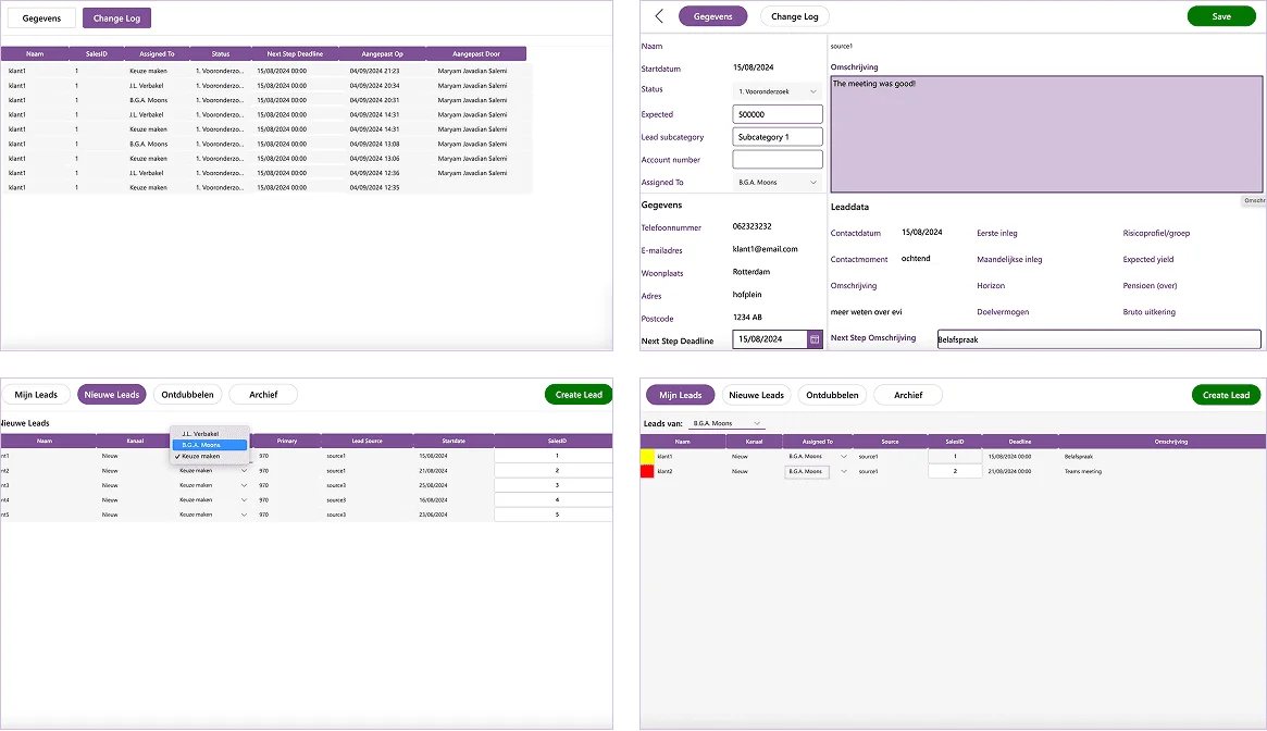
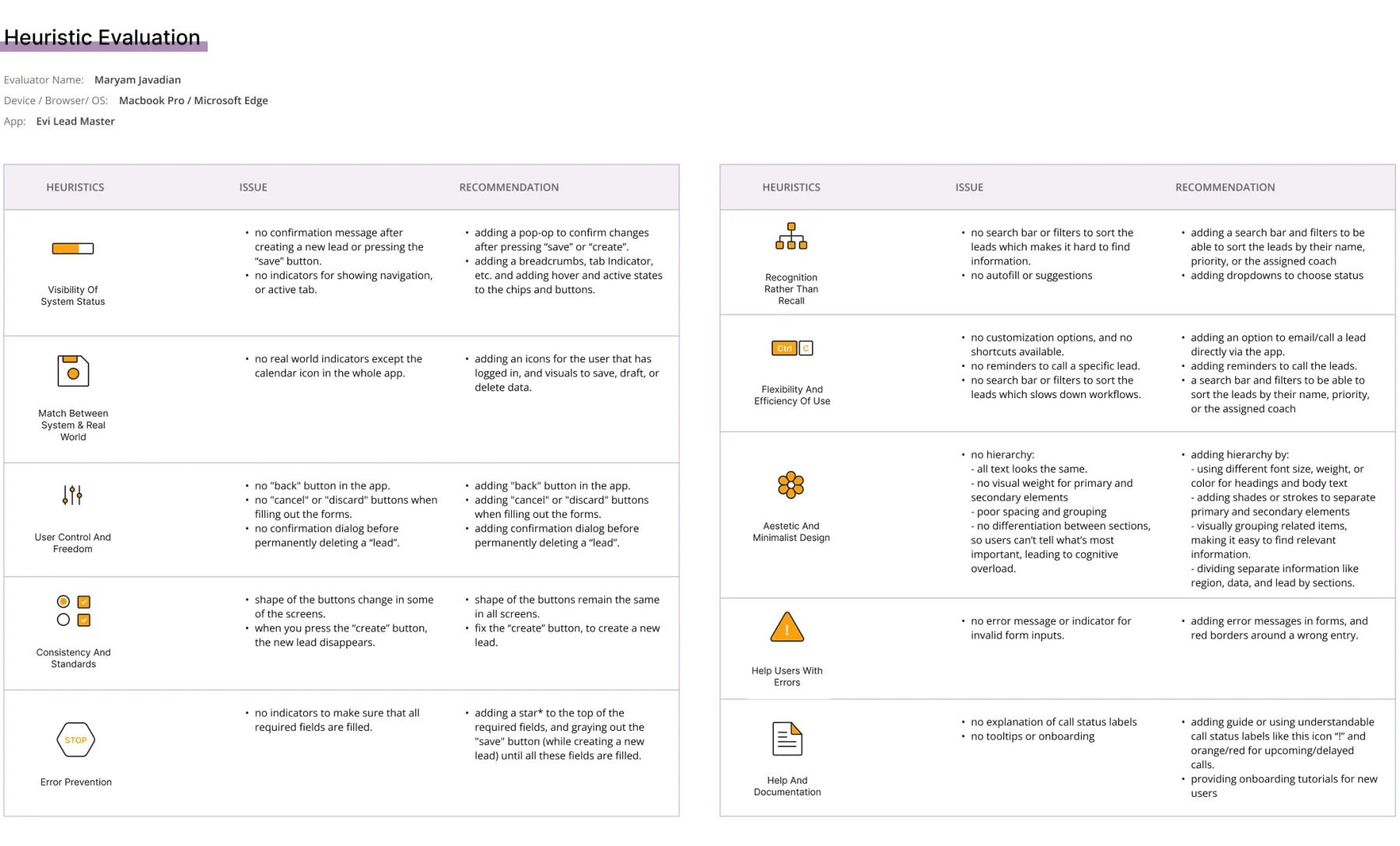
I ran a heuristic evaluation against Jakob Nielsen's ten usability heuristics on the existing design, surfacing concrete issues: no confirmation after saving, no back button, inconsistent button shapes, no hierarchy between primary and secondary content, no search or filters, no error messages on invalid input, each paired with a specific recommendation.
The design
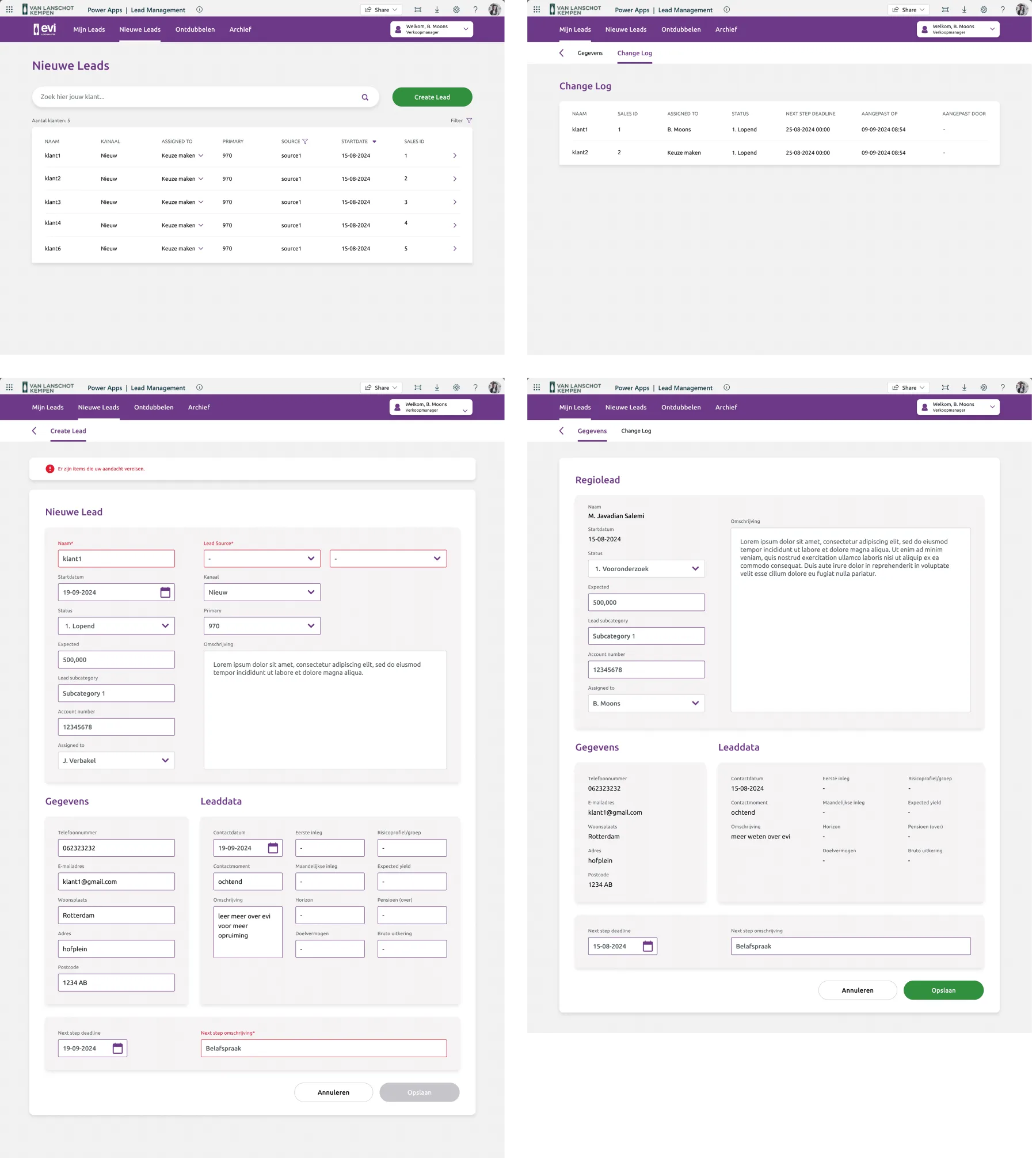
The redesign optimised text size, contrast and interactive elements for consistency with other Evi apps; added hierarchy through an enhanced navigation bar with sub-navigation; used colour coding for urgency (red overdue, orange upcoming, green completed); added a “cancel” action next to “save”; added filtering, sorting and search for leads; added hover states for clearer interaction; kept headers stable when switching between chips; and surfaced a customer count so users could see how many rows sat on each page.
The logo
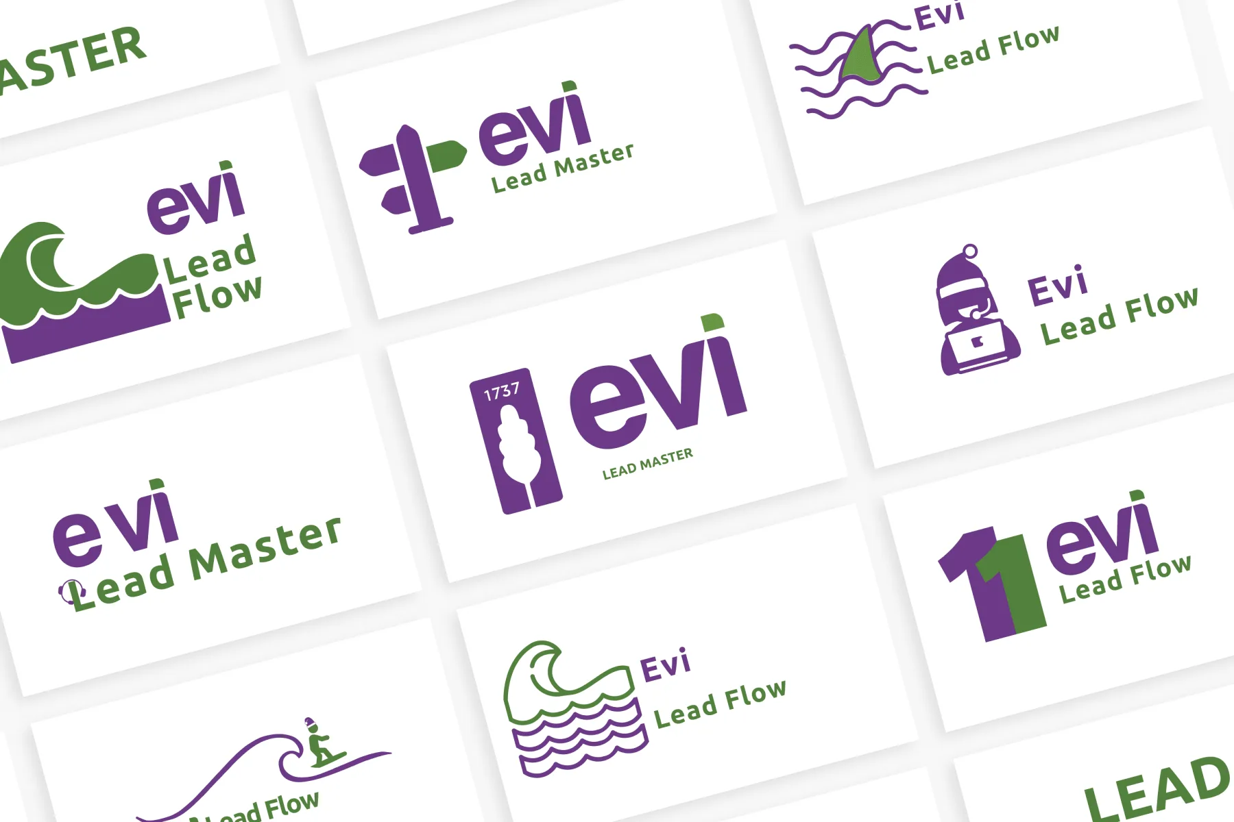
I designed several logo alternatives and presented them to stakeholders. After some back and forth, we decided to keep the branding simple and closely aligned with Evi's other products, iterating on both the mark and the name. We chose “Master” over “Flow” to empower the sales team: after all, they're the masters of this flow.
Results
The redesign improved user experience and satisfaction, reduced customer-support call errors by 15%, optimised daily workflows for wealth coaches, improved coordination within the sales team, and applied user-centered accessibility principles throughout. After the first prototype, usability tests with sales representatives surfaced further refinements, like dropdowns on the “Create a New Lead” form and clearer navigation, which were folded back into the final design.
With the redesigned platform in place, the focus shifts to monitoring adoption (how representatives actually use the new design and what issues remain), refining features based on ongoing feedback, and ensuring the platform scales with future growth.