Turning an invisible tax allowance into something people act on
Jaarruimte: from a number nobody could find, to a decision people could make.
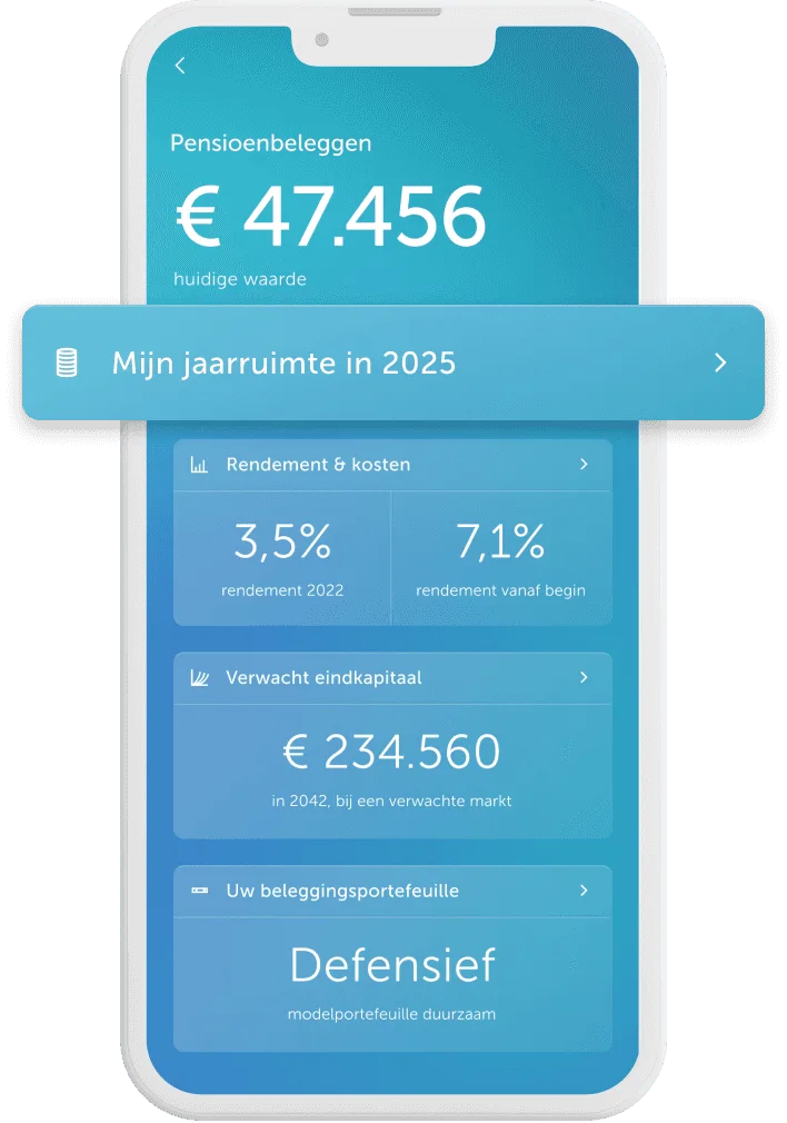
Dutch savers can deposit a set amount into a private pension each year and deduct it from their taxable income. It's called jaarruimte, it expires at year end, and it used to live only on Brand New Day's website. This project didn't just bring it into the app, it defined how it works there: a calculator flow redesigned for mobile, a graph specified across seven states, and entry points routing each client by their situation. It reached around 10,000 clients in its first year.
Problem & context
Jaarruimte expires. Unused allowance doesn't roll over, so missing the window costs you the tax benefit for that year, and it's easy to miss since it isn't visible in the app. Acting in time means knowing your number, and getting the number takes two documents and about ten minutes of work.
The company wanted deposit turnover, and jaarruimte season was approaching, so the feature had to be live and stable before the year-end deposit window opened.
The calculation is indicative only and must defer to the Dutch tax authority. Copy was never designer-owned: some was inherited from web, the rest written by the PM and cleared through legal. The design system was closer to a UI kit; four components had to be built. And the app could never block a deposit, whatever it displayed.
Research & insights
We were wrong about awareness
We assumed people didn't know what jaarruimte was. Earlier research for the web version found roughly 80% recognised the term, and that reordered the work, since explaining the concept became a supporting layer, not the main event.
Yet awareness was not enough
There's no standard amount. It depends on what you earned last year, how you earned it, and how much pension you already built up. The tax authority changes the formula every year, and it's a complicated one. Nobody has the figure in their head, and it has to be recalculated annually.
The number had nowhere to live
Awareness wasn't the barrier. The data was complex, hidden and boring while sitting behind a web tool people had to seek out, and the app showed nothing at all.
The solution
A · The calculator
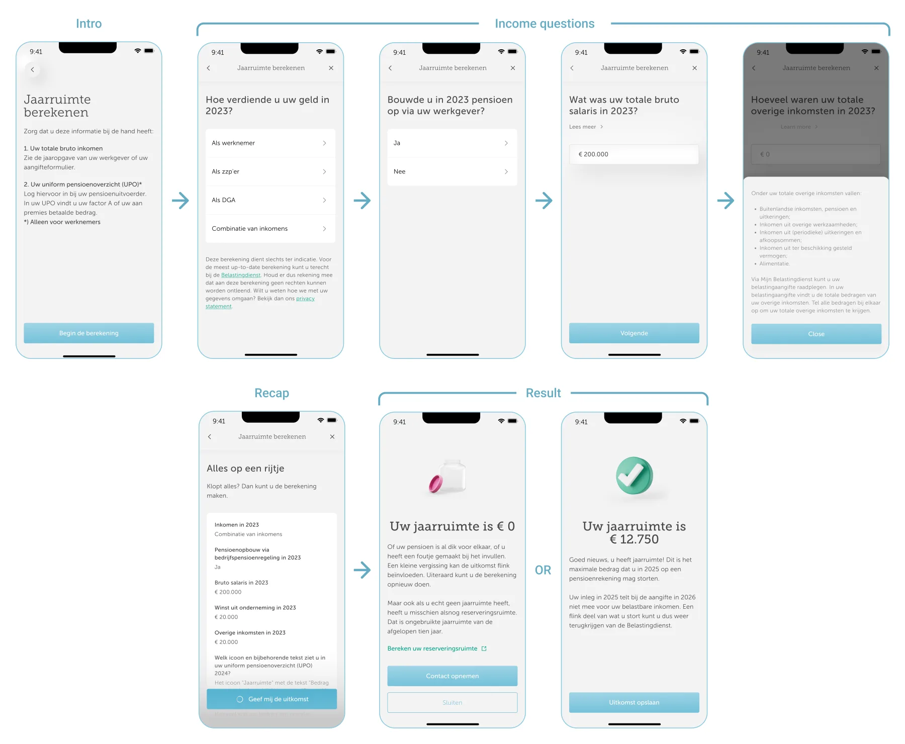
A guided flow, instead of a form. The path adapts to how you earn, so you never see fields that don't apply. The intro shows the two documents you'll need before you start, because finding that out mid-flow is where people quit.
B · The graph
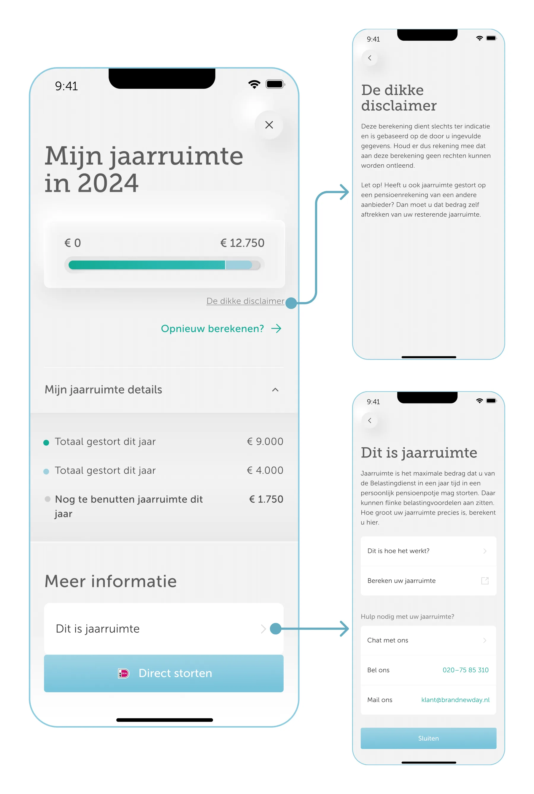
A single bar from €0 to your allowance, in three parts: deposited, scheduled to be paid, and unused. Scheduled money had to be visible, so someone with a monthly direct debit could see it and avoid depositing more than their allowance.
C · Entry points
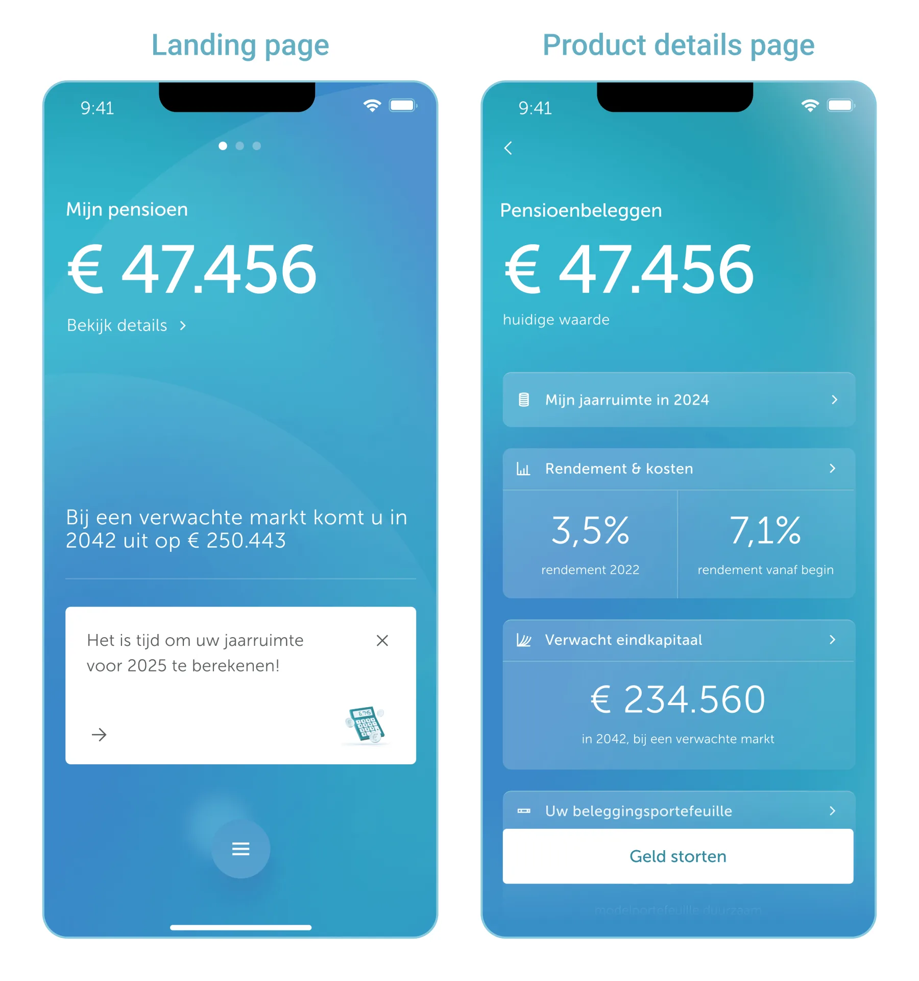
Every pension screen routes by situation: no calculation leads to the calculator, a current calculation leads to the graph, and an outdated one leads to the graph with a prompt to recalculate.
Designing the edges
The whole designed system was more than just one happy path. The bar has to handle a quantity that can exceed a maximum: you can deposit more than your calculated allowance, or scheduled deposits might push you past it, and each of those has different tax consequences. Seven states were specified in total.
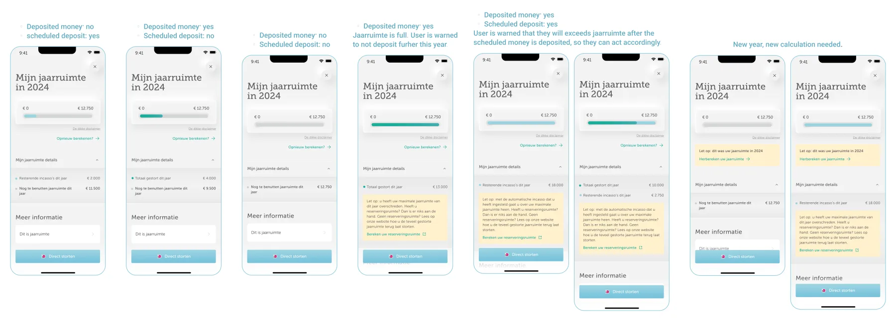
Warn, never block. Going over your allowance isn't always a mistake. Unused allowance from previous years can make it fine, and the app can't know whether that applies. So every warning state keeps the deposit button live, explains the situation, and links out to check. The interface flags; the client decides.
Show both numbers, even when one is invisible. When the allowance is exceeded, the bar turns fully dark green and the scheduled segment hides beneath it, so the legend still lists both. Otherwise someone with money still leaving their account would see no scheduled row at all.
Two decisions under pressure
The graph shipped before the calculator, so for a while anyone without a number had no way to get one in the app. The interim answer was a link out to the web, which our PM spotted was showing in the wrong place. We pulled it from the entry point and kept it only inside the graph's explainer, where leaving the app made sense. The design also specified the swap: once the native calculator went live, the external-link icon became a chevron.
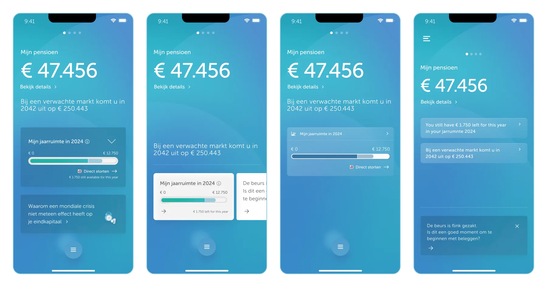
Early iterations gave jaarruimte its own card on the pension screen, which meant taking space from the forecast message or the article block. None of it survived. The answer was a single row in the existing card stack, which cost the screen nothing and still put the number where people would find it.
How the work ran
Department heads from Commerce, Sales and Customer Service joined design refinement sessions throughout, and the graph's contents and the entry-point placement took the most rounds. Engineering came in once feasibility mattered, with the BA present. Before handover, design, BA, front-end, back-end and QA walked every scenario and error state together. For a feature with seven graph states, that pass is what kept edge cases from becoming defects.
Impact
Graph screen, first twelve months (GA4, June 2025 – June 2026):
What this doesn't show: conversion events were never set up for the app version, so there's no deposit attribution. These numbers prove people found the feature and stayed with it. They don't prove it moved deposits.
We never measured the goal
The feature was funded to increase deposits, and nothing was wired up to connect seeing the graph with making one. What to measure should have been agreed while it was being designed.
No usability testing on the app version
The feature already existed on web, so the concept was treated as validated and the app work as a port. But a graph and a multi-step calculator behave differently on a phone, and comprehension of the app version has never been tested.
What I'd add next
A record of previous years. Right now each calculation replaces the last, so there's nothing to look back at, and I raised this as a backlog ticket after launch. Beyond that, the connections: the app shows what you've deposited, what's scheduled, your allowance and your projected capital, each as a separate number. Making those relationships visible is the bigger problem.